-
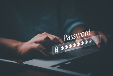 Identify, Authenticate, Authorize: The Three Key Steps in Access SecurityBLOGPOST • PRIVILEGED ACCESS MANAGEMENT
 -
 Infographic: Ensuring NIS Directive Security Compliance with WALLIXAUDIT & COMPLIANCE • BLOGPOST
 -
 Securing Endpoint Vulnerabilities with EPM to Stop PrintNightmareBLOGPOST • ENDPOINT PRIVILEGE MANAGEMENT
 -
 Protecting vulnerable healthcare IT infrastructure in the face of growing...BLOGPOST • CRITICAL INFRASTRUCTURE • HEALTHCARE • IT TEAM EFFICIENCY • PUBLIC SECTOR
 -
 Privileged Access Management: Key to Compliance with the NIS/NIS2 DirectivesAUDIT & COMPLIANCE • WHITEPAPER
 -
 5 Reasons Privileged Account Discovery Is the First Step Toward...BLOGPOST • PRIVILEGED ACCESS MANAGEMENT
 -
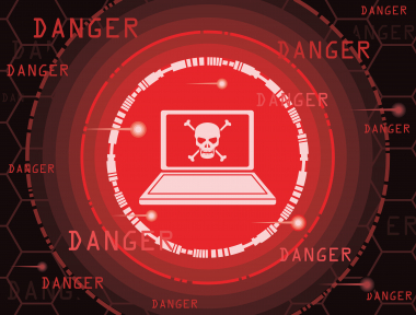 REvil ransomware: how least privilege could have saved AcerBLOGPOST • ENDPOINT PRIVILEGE MANAGEMENT
 -
 How PAM Enables IEC 62443 ImplementationAUDIT & COMPLIANCE • BLOGPOST • INDUSTRY • PRIVILEGED ACCESS MANAGEMENT
 -
 Bastion Session Sharing: Empowering Secure Remote CollaborationBLOGPOST • PRIVILEGED ACCESS MANAGEMENT • REMOTE ACCESS
 -
 Defending Against Remote Access Risks with Privileged Access ManagementBLOGPOST • PRIVILEGED ACCESS MANAGEMENT • REMOTE ACCESS
 -
 Cyber Insurance | Protect Your Business Against Cyber Attacks with...BLOGPOST • CYBER INSURANCE • PRIVILEGED ACCESS MANAGEMENT
 -
 Privileges, Not Rights: Keeping Control with Privileged Access ManagementBLOGPOST • PRIVILEGED ACCESS MANAGEMENT
 -
 The CISO’s Guide to Security Compliance (with PAM)AUDIT & COMPLIANCE • BLOGPOST • PRIVILEGED ACCESS MANAGEMENT
 -
 Ensuring Compliance with PAM: Cross-Mapping Security StandardsAUDIT & COMPLIANCE • BLOGPOST • PRIVILEGED ACCESS MANAGEMENT
 -
 Azure Security Monitoring and Privileged Access Management (PAM)BLOGPOST • PRIVILEGED ACCESS MANAGEMENT
 -
 Controlling Privileged Access for Telecommunications & Cloud Service ProvidersBLOGPOST • CLOUD SECURITY • CRITICAL INFRASTRUCTURE • INDUSTRY
 -
 ICS Security: Using PAM for Industrial Control Systems SecurityBLOGPOST • PRIVILEGED ACCESS MANAGEMENT
 -
 Privileged Access Management’s Role in HIPAA ComplianceBLOGPOST • HEALTHCARE • PRIVILEGED ACCESS MANAGEMENT
 -
 Maintaining Data Integrity with Privileged Access ManagementBLOGPOST • PRIVILEGED ACCESS MANAGEMENT
 -
 Privileged User Monitoring: Why Continuous Monitoring is KeyBLOGPOST • PRIVILEGED ACCESS MANAGEMENT
 -
 Retail at Risk: Cybersecurity Challenges and SolutionsBLOGPOST • PRIVILEGED ACCESS MANAGEMENT
 -
 "Just-In-Time", A Key Strategy For Access SecurityBLOGPOST • ENDPOINT PRIVILEGE MANAGEMENT • PRIVILEGED ACCESS MANAGEMENT
 -
 The Bastion secures your applications with AAPMBLOGPOST • DEVOPS • PRIVILEGED ACCESS MANAGEMENT
 -
 Securing Remote Access with Privileged Access ManagementBLOGPOST • PRIVILEGED ACCESS MANAGEMENT • REMOTE ACCESS
 -
 Understanding the Uber hack with Privileged Access Management (PAM)BLOGPOST • PRIVILEGED ACCESS MANAGEMENT
 -
 A Cybersecurity Ecosystem Is the Key to Great IT SecurityBLOGPOST • PRIVILEGED ACCESS MANAGEMENT
 -
 Enterprise Password Management Software: WALLIX Bastion Password ManagerBLOGPOST • PRIVILEGED ACCESS MANAGEMENT
 -
 IDaaS and Access: Don't be kicked out by the VIP...BLOGPOST • Digital Transformation • ENDPOINT PRIVILEGE MANAGEMENT • IDaaS
 -
 PAM for Financial Services: Preventing Cyber-Attacks in FinanceBLOGPOST • FINANCE & INSURANCE • PRIVILEGED ACCESS MANAGEMENT
 -
 The Critical Elements of a Scalable PAM SolutionBLOGPOST • Digital Transformation • PRIVILEGED ACCESS MANAGEMENT
 -
 Least Privilege At Work: PEDM and Defense in DepthBLOGPOST • PRIVILEGED ACCESS MANAGEMENT
 -
 PAM-ITSM Integration: What Good Practices Should Be Applied?BLOGPOST • IDaaS • PRIVILEGED ACCESS MANAGEMENT
 -
 Securing DevOps in the Cloud with Privileged Access Management (PAM)BLOGPOST • CLOUD SECURITY • DEVOPS • Digital Transformation • PRIVILEGED ACCESS MANAGEMENT
 -
 No Spring Break for Schools: Social Engineering Attacks on the...BLOGPOST • EDUCATION • PRIVILEGED ACCESS MANAGEMENT • REMOTE ACCESS
 -
 PAM, SIEM, and SAO: Leveraging Cybersecurity Tools to Move the...BLOGPOST • INSIDER THREAT • PRIVILEGED ACCESS MANAGEMENT
 -
 Endpoint Privilege Management: A New Generation of 007BLOGPOST • ENDPOINT PRIVILEGE MANAGEMENT
 -
 Why Privileged Account Security Should Be Your #1 PriorityBLOGPOST • Digital Transformation • PRIVILEGED ACCESS MANAGEMENT
 -
 Uniting Identity Access Management (IAM) and PAM for Cohesive Identity...BLOGPOST • IDENTITY AND ACCESS GOVERNANCE • PRIVILEGED ACCESS MANAGEMENT
 -
 Utilizing Session Management for Privileged Account MonitoringBLOGPOST • PRIVILEGED ACCESS MANAGEMENT
 -
 ISO 27001: Understanding the Importance of Privileged Access Management (PAM)AUDIT & COMPLIANCE • BLOGPOST • PRIVILEGED ACCESS MANAGEMENT
 -
Bring a Privileged Access Management Policy to LifeBLOGPOST • PRIVILEGED ACCESS MANAGEMENT
-
OT in Hospitals: The Achilles Heel of the Healthcare IndustryBLOGPOST • HEALTHCARE • PRIVILEGED ACCESS MANAGEMENT • REMOTE ACCESS
-
 What Happened in the Colonial Pipeline Ransomware AttackBLOGPOST • CRITICAL INFRASTRUCTURE • ENDPOINT PRIVILEGE MANAGEMENT • INDUSTRY • PRIVILEGED ACCESS MANAGEMENT
 -
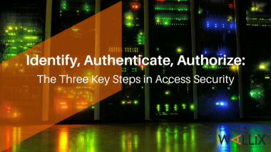 Identify, Authenticate, Authorize: The Three Key Steps in Access SecurityBLOGPOST • ENDPOINT PRIVILEGE MANAGEMENT • PRIVILEGED ACCESS MANAGEMENT • ZERO TRUST
 -
 Offense or Defense? An Ethical Hacker’s Approach to CybersecurityBLOGPOST • PRIVILEGED ACCESS MANAGEMENT
 -
 GDPR and Privileged Access Management (PAM): What International Businesses Need...AUDIT & COMPLIANCE • BLOGPOST • PRIVILEGED ACCESS MANAGEMENT
 -
 IGA and PAM: How Identity Governance Administration Connects with PAMBLOGPOST • IDENTITY AND ACCESS GOVERNANCE • PRIVILEGED ACCESS MANAGEMENT
 -
 Maintaining Visibility Over Remote Access with Session ManagementBLOGPOST • PRIVILEGED ACCESS MANAGEMENT
 -
 SSH agent-forwarding: Going barefoot (socket-less)BLOGPOST • PRIVILEGED ACCESS MANAGEMENT
 -
 What is the Principle of Least Privilege and How Do...BLOGPOST • PRIVILEGED ACCESS MANAGEMENT
 -
 Enable secure application-to-application communicationBLOGPOST • PRIVILEGED ACCESS MANAGEMENT
 -
 Privileged Access Management (PAM) for MSSPs Using AWSBLOGPOST • CLOUD SECURITY • PRIVILEGED ACCESS MANAGEMENT
 -
 Universal Tunneling: Secure & Simple OT ConnectionsBLOGPOST • INDUSTRY • PRIVILEGED ACCESS MANAGEMENT • REMOTE ACCESS
 -
 SCADA Security and Privileged Access Management (PAM)AUDIT & COMPLIANCE • BLOGPOST • INDUSTRY • PRIVILEGED ACCESS MANAGEMENT
 -
 WALLIX Access Manager 2.0: Granting remote access without compromising securityBLOGPOST • DEVOPS • PRIVILEGED ACCESS MANAGEMENT
 -
 WALLIX positioned as a Leader in the 2022 Gartner® Magic...BLOGPOST • PRIVILEGED ACCESS MANAGEMENT
 -
 Healthcare Cybersecurity: Why PAM Should Be a PriorityBLOGPOST • HEALTHCARE • PRIVILEGED ACCESS MANAGEMENT
 -
 Current challenges and solutions: What trends are taking off in...BLOGPOST • DEVOPS • PRIVILEGED ACCESS MANAGEMENT • ZERO TRUST
 -
 The five top tips to reassess your IT security riskBLOGPOST • CRITICAL INFRASTRUCTURE • PRIVILEGED ACCESS MANAGEMENT
 -
 The Internet of Medical Things (IoMT) : Safeguarding increasingly vulnerable...BLOGPOST • HEALTHCARE
 -
 Securing financial institutions with the help of PAM solutionsBLOGPOST • FINANCE & INSURANCE • PRIVILEGED ACCESS MANAGEMENT
 -
 Cybersecurity and health: "the challenge is not only financial but...BLOGPOST • HEALTHCARE
 -
 International tensions: manage the implementation of cybersecurity measures in emergency...BLOGPOST • CRITICAL INFRASTRUCTURE • PRIVILEGED ACCESS MANAGEMENT
 -
 Top 5 Considerations When Implementing an IDaaS SolutionIDaaS • IDENTITY AND ACCESS GOVERNANCE • WHITEPAPER
 -
 Zero Trust CybersecurityIDENTITY AND ACCESS GOVERNANCE • IT TEAM EFFICIENCY • PRIVILEGE ACCESS MANAGEMENT • WHITEPAPER • ZERO TRUST
 -
Key Considerations for SaaS Adoption and Top 10 Reasons Why...PRIVILEGE ACCESS MANAGEMENT • WHITEPAPER
-
 Securing Identities and Access in EducationEDUCATION • IDENTITY AND ACCESS GOVERNANCE • WHITEPAPER
 -
7 key aspects to consider before selecting IAG as a...IDENTITY AND ACCESS GOVERNANCE • WHITEPAPER
-
 Modernize Identity and Access Governance (IAG) for NIS2 Compliance: Time...BLOGPOST • IDENTITY AND ACCESS GOVERNANCE • PRIVILEGED ACCESS MANAGEMENT
 -
Unravelling Directive NIS2 and Its Impact on European BusinessesAUDIT & COMPLIANCE • BLOGPOST
-
 Managing risks associated with identity and access governance: 5 pitfalls...BLOGPOST • IDENTITY AND ACCESS GOVERNANCE
 -
 The railway sector and the cybersecurity challengesBLOGPOST • INDUSTRY • INDUSTRY PROTOCOLS • PRIVILEGED ACCESS MANAGEMENT • REMOTE ACCESS
 -
How to Apply the Principle of Least Privilege (POLP) in...BLOGPOST • IDENTITY AND ACCESS GOVERNANCE
NIS 2 Directive Unpacked
DOWNLOAD OUR WHITEPAPERAll you need to know about the NIS 2 Directive
Discover our new whitepaper
in collaboration with


 DOWNLOAD REPORT NOW!
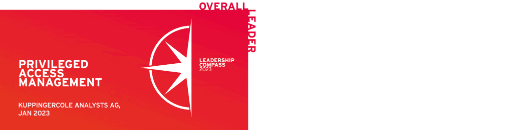
WALLIX is named an “Overall Leader”
in the KuppingerCole Analyst 2023
Leadership Compass
for Privileged Access Management.

Customer First | Innovation | Simplicity
Trusted European leader in Identity and Access Security
WALLIX is a European leader in identity and access cybersecurity solutions, present in over 90 countries worldwide, with employees in 16 countries, offices in 8 cities and a network of over 300 resellers and integrators.
Recognized by industry leading analysts, Gartner, Forrester, KC & co
The WALLIX solution suite is flexible, resilient, quick to deploy and easy to use, and WALLIX is recognized by industry analysts (Gartner, Kuppingercole, Forrester, Frost & Sullivan) as a leader in the field of privileged access management.
Distributed partners in 90 countries
WALLIX Partners help organisations reduce cyber risks, embrace innovation and disruptive technologies securely, manage flexibility and cost, and improve operational resilience.
More than 3000 customers worldwide
The WALLIX solution suite is distributed by a network of over 300 resellers and integrators worldwide, and WALLIX supports over 3,000 organizations in securing their digital transformation.
Simplify your cybersecurity with WALLIX and ensure your most critical systems are protected from internal and external threats.

Success Stories
“Thanks to the WALLIX PAM, the product has shown that it is perfectly adapted to our perimeter both in terms of scale and simplicity. To summarize, WALLIX offers the best value for our requirements”
“Ever since we started working with WALLIX IAG solution, I don’t think we have truly reduced the duration of review campaigns. However, within the same timeframe, we transitioned from reviewing a single scope (Mainframe) to reviewing over 150 applications, for both Administrative and Distributor populations.”
“Thanks to its access control and administration traceability features, WALLIX solution has enabled us to considerably strengthen the security of our infrastructures and equipment.”

The Privileged Access Management by WALLIX
Privileged, administrative, or overly empowered accounts are consistently among attackers’ main targets and frequently lead to major breaches. Leaders overseeing identity and access management should be implementing privileged access management (PAM) to protect these critical accounts.
Ready to get started
with WALLIX PAM?
Request your 30-day free trial


Find out how our products can meet your needs


Fill the form to find out more about our products
Safeguarding customers across the globe